FREELETICS
Role
Mobile Product Design
Tasks
UX Research & Visual Design
Platforms
Web & Mobile
Year
2021
How might we modernize and unify the Freeletics experience?
Since the inception of Freeletics in 2013, there hasn't been a major refresh of the brand language. In 2021, it's still perceived by many people, especially people who knew Freeletics from the beginning, as a hardcore product that will make you fit if you can somehow make it through the training programs.
As the product grows and expands, the brand needs to scale alongside. Our product offering is more mature, inclusive, and approachable, while still offering the same results orientation and transformational routines. Freeletics has outgrown its initial hardcore design and has matured as an industry-leading product. It's time to update the visual language to reflect this premium offering, while also addressing some years-old design debt.
Desirability testing planning
Since the inception of Freeletics in 2013, there hasn't been a major refresh of the brand language. In 2021, it's still perceived by many people, especially people who knew Freeletics from the beginning, as a hardcore product that will make you fit if you can somehow make it through the training programs.
As the product grows and expands, the brand needs to scale alongside. Our product offering is more mature, inclusive, and approachable, while still offering the same results orientation and transformational routines. Freeletics has outgrown its initial hardcore design and has matured as an industry-leading product. It's time to update the visual language to reflect this premium offering, while also addressing some years-old design debt.
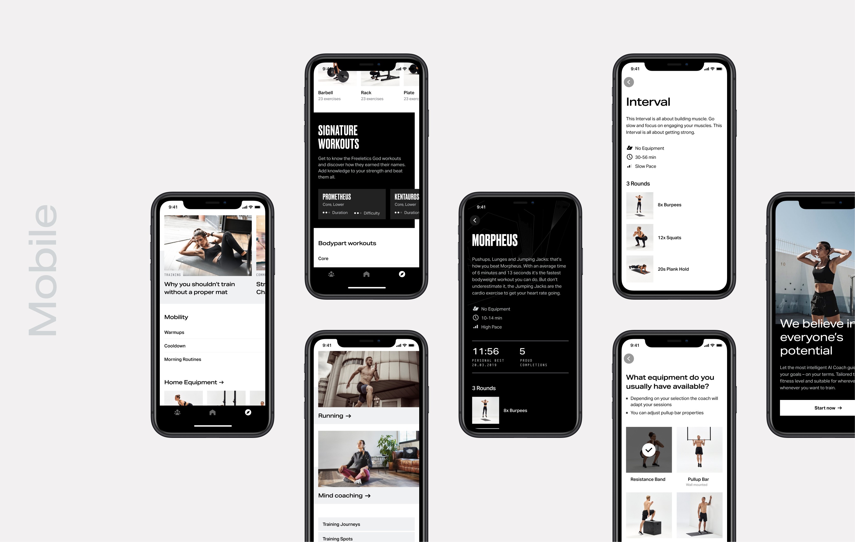
Implementation on mobile
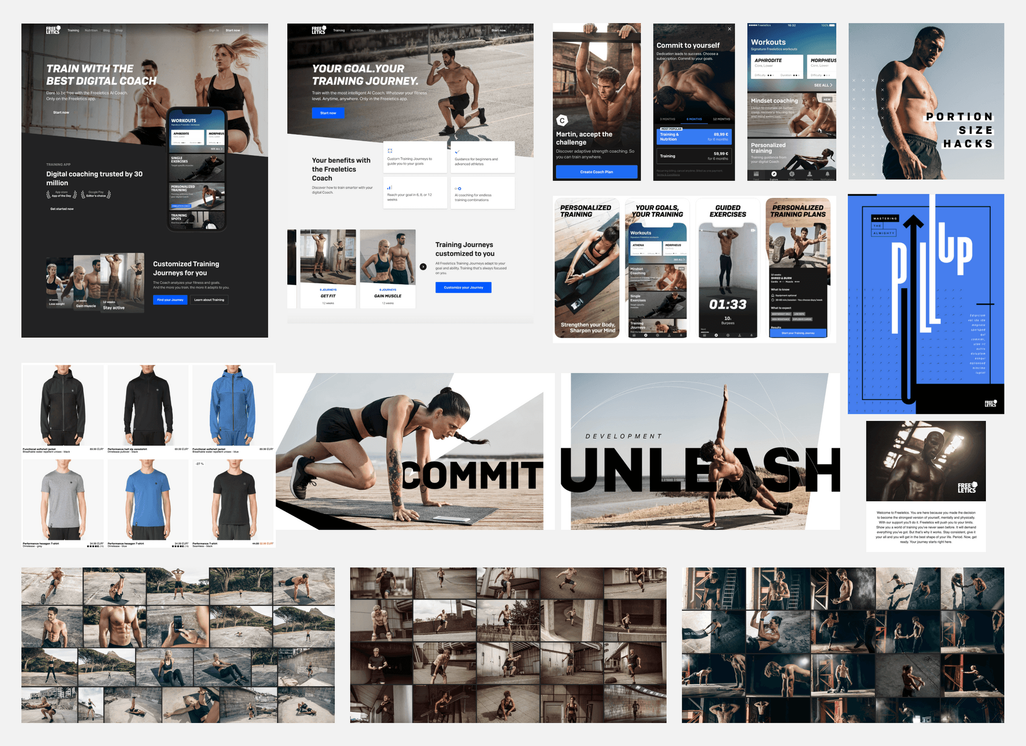
When the time came for execution, I worked on the mobile app visual refresh together with the Design Ops peer. From January to March 2021, I focused on designing and polishing the UI layout and components that built up each mobile app features. These designs went through multiple critiques with the UX team and the brand team in order to get alignment before release.
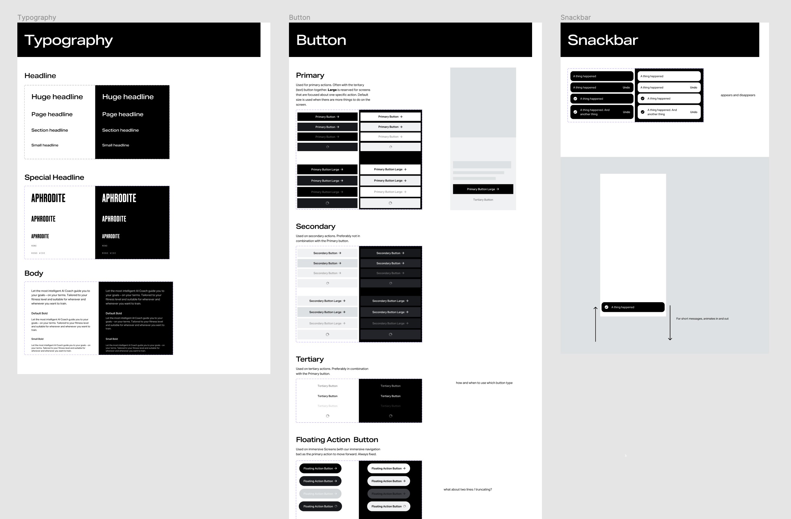
UI components
In addition, I supported the creation and adoption of the new design components in Figma. This work helped us quickly make updates during Visual Refresh mobile changes, eliminated a significant amount of design debt, and now allows teams to build designs even faster.
Main objetives.
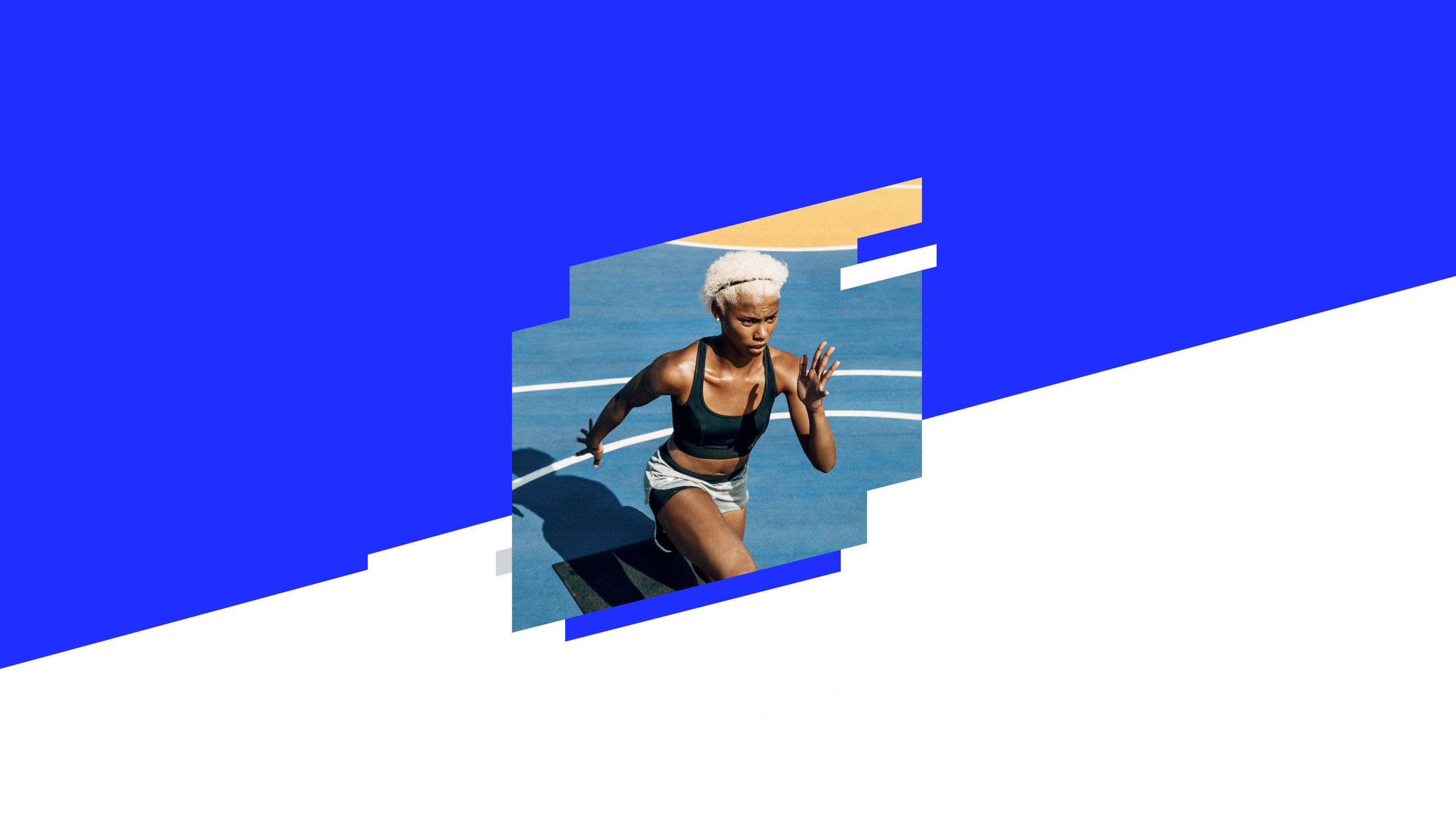
Be more gender-neutral
Rebalance the masculine focus of the brand. The predominantly male photography, the tone of voice and idea of success comes from a masculine perspective of tough and unforgiving. There is also an overuse of ALL CAPS which comes across as aggressive and yell-y.
Rebalance the masculine focus of the brand. The predominantly male photography, the tone of voice and idea of success comes from a masculine perspective of tough and unforgiving. There is also an overuse of ALL CAPS which comes across as aggressive and yell-y.
Align design across departments
Develop for a cohesive design language between product and marketing.
Create a Single Source of Truth library and style guide to help current designers and new designers or freelancers create work with confidence.
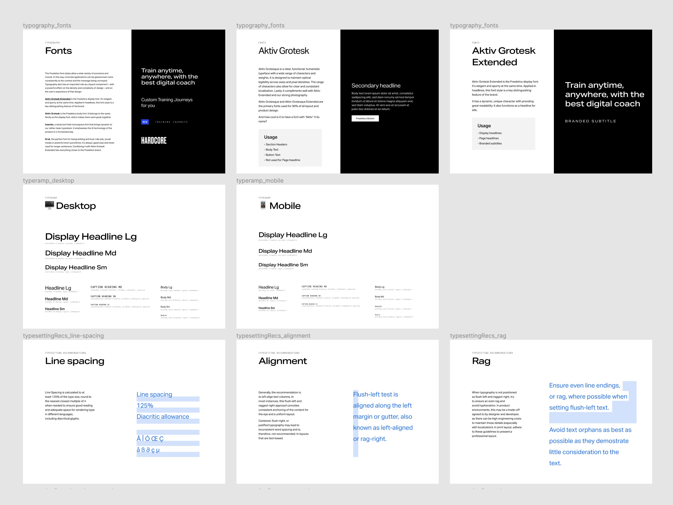
Select a new typefaces that scales and localizes to all of the languages we support.
Visual refresh, no redesign.
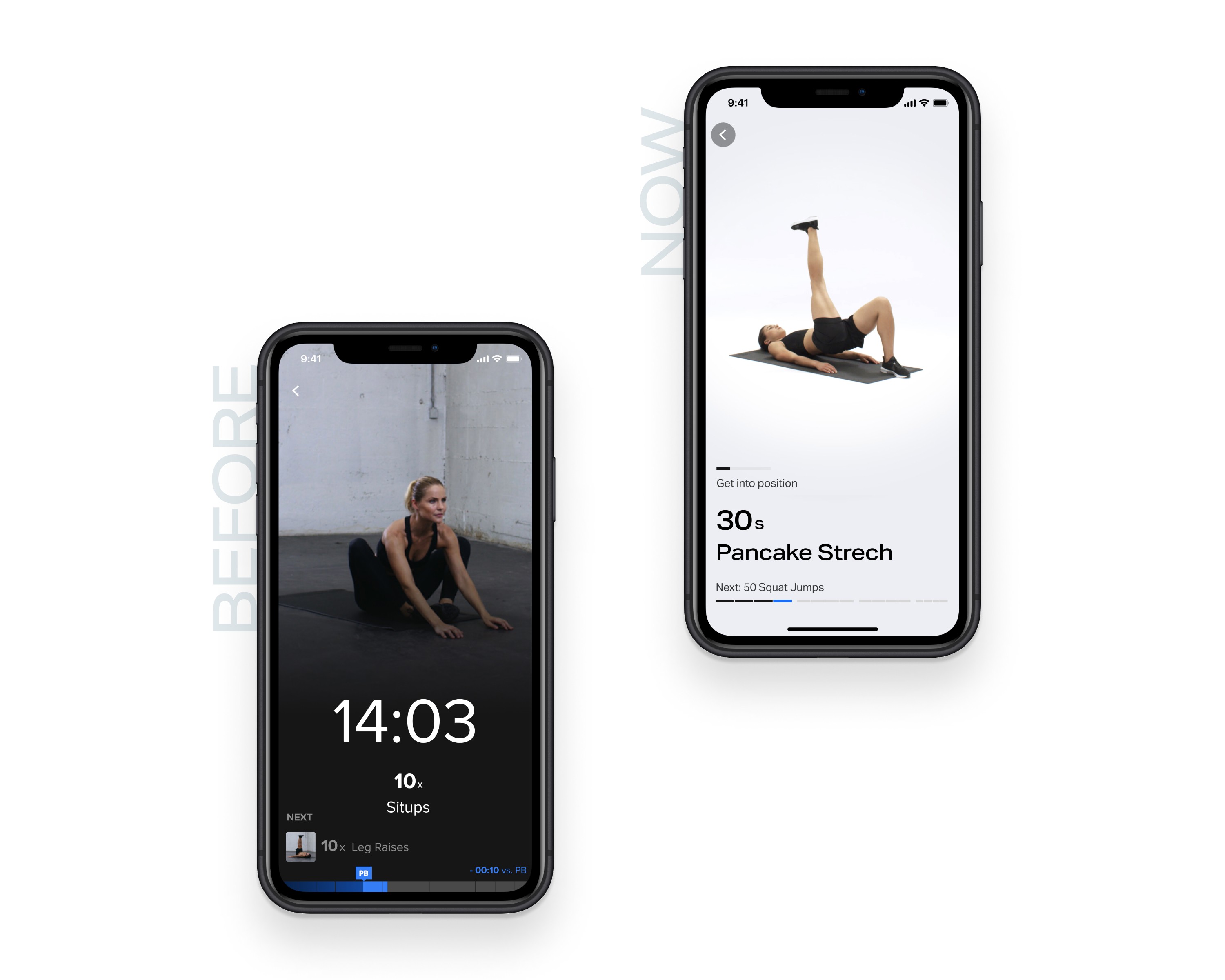
Defining a monochrome product
Over the years Freeletics had developed a connection to blue (Marketing ornaments, UI CTAs, etc.). However, Freeletics is not a blue brand: Freeletics is a monochromatic brand. With great restraint, we went for a very limited product color palette and a set of colors used explicitly only for brand moments and usability cases. This allowed us to emphasize content and layout, simplify our designs, eliminate dozens of blue hex values in our code, and clean up design debt from years ago.
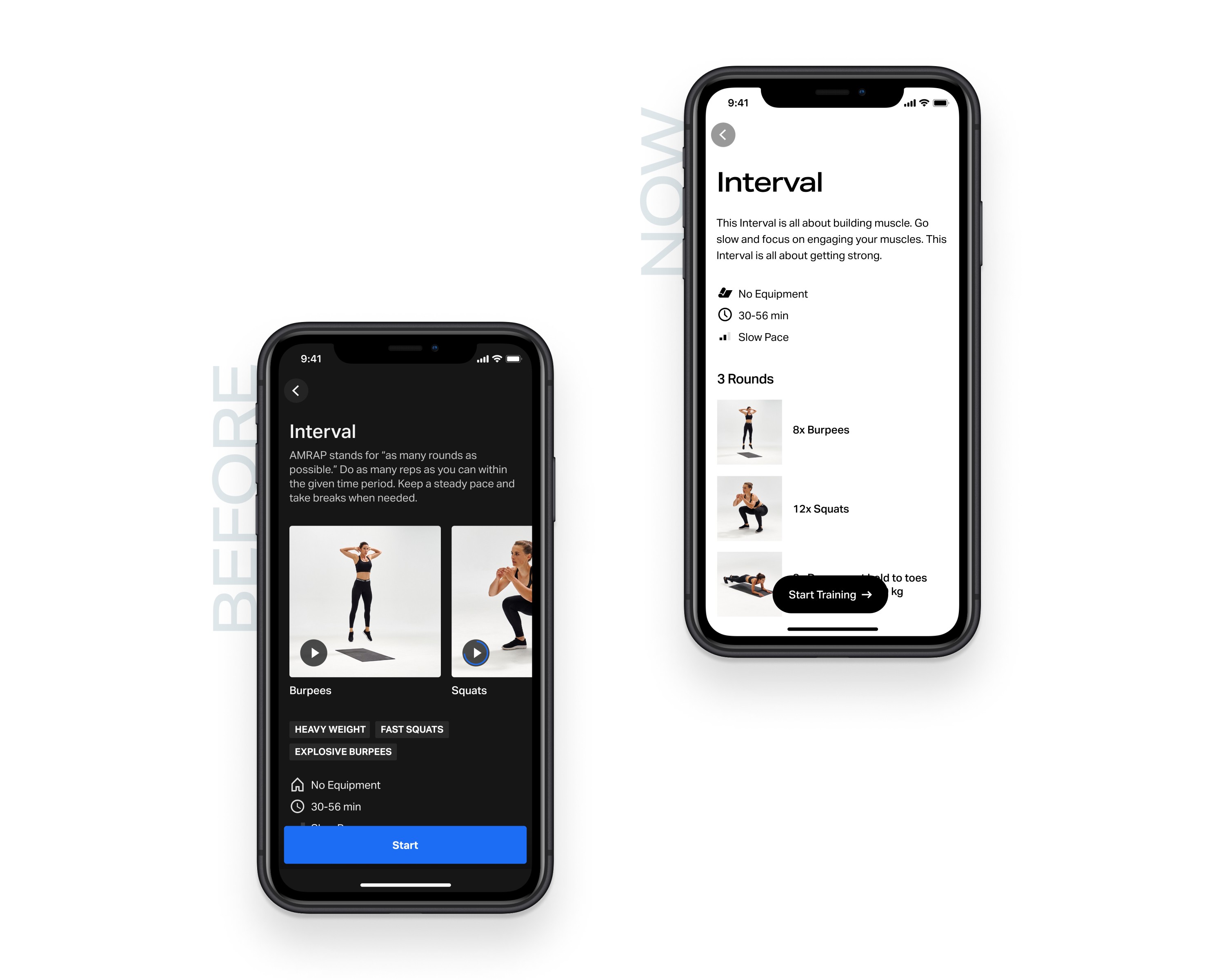
Make it stand out
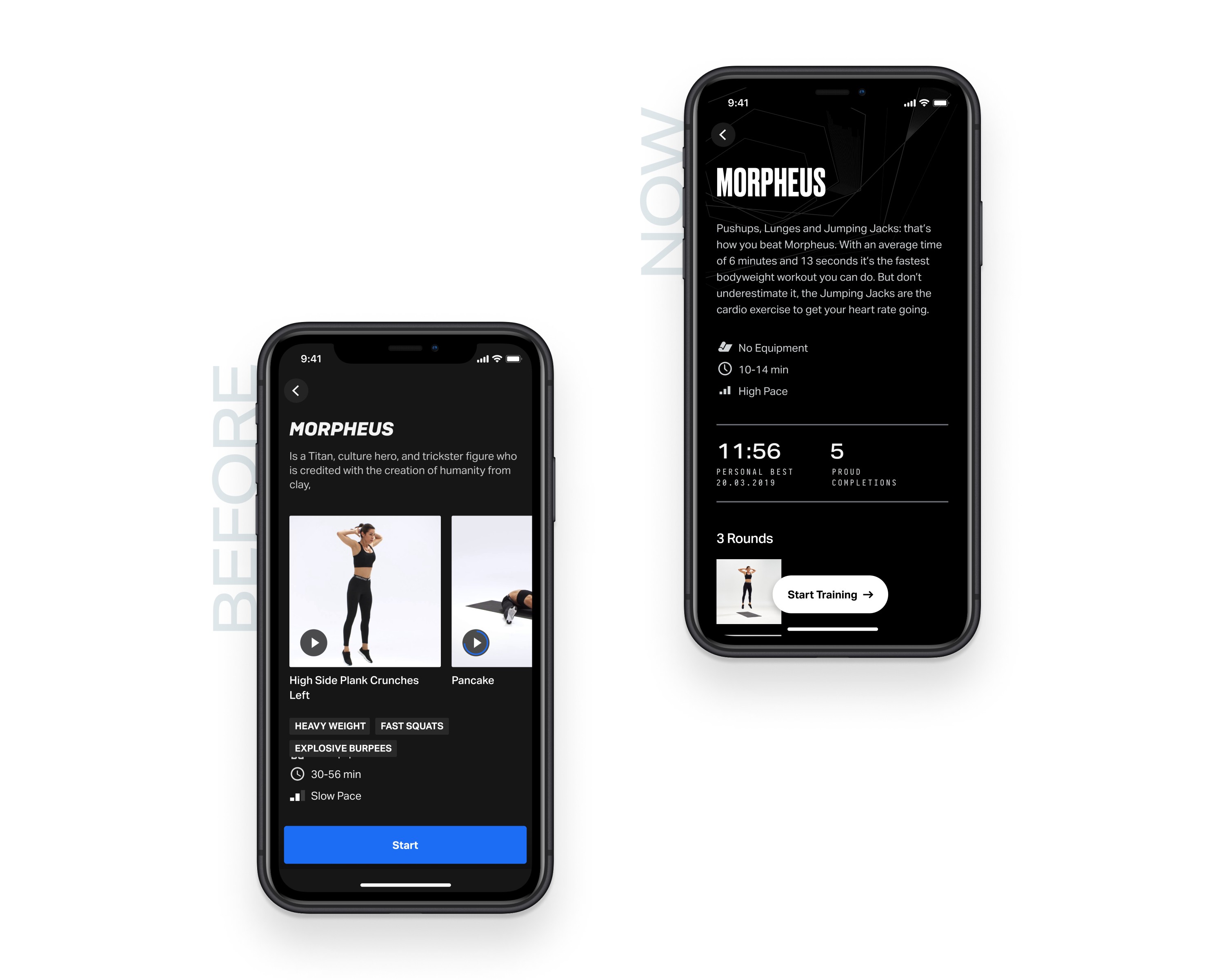
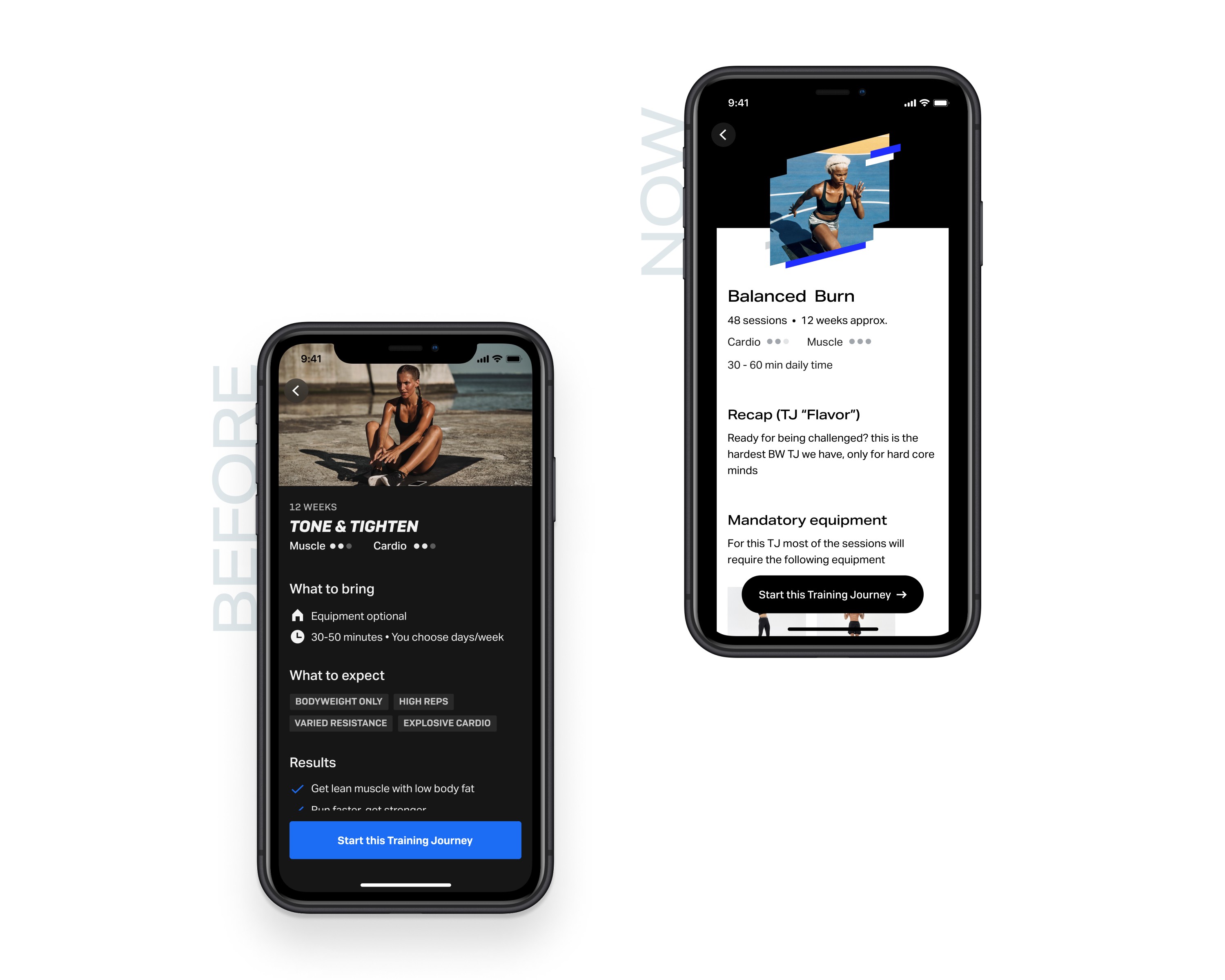
Since we made the decision to move toward a monochrome product color palette, we needed to be very deliberate in how we used the brand colors. For key brand moments, like Training Journeys, God Workouts (Signature Freeletics workouts), and Achievements, we move to a dark theme, with the rest of the product being light theme. This helped to give a visual indication of a special moment in the experience.
First visual update in years.
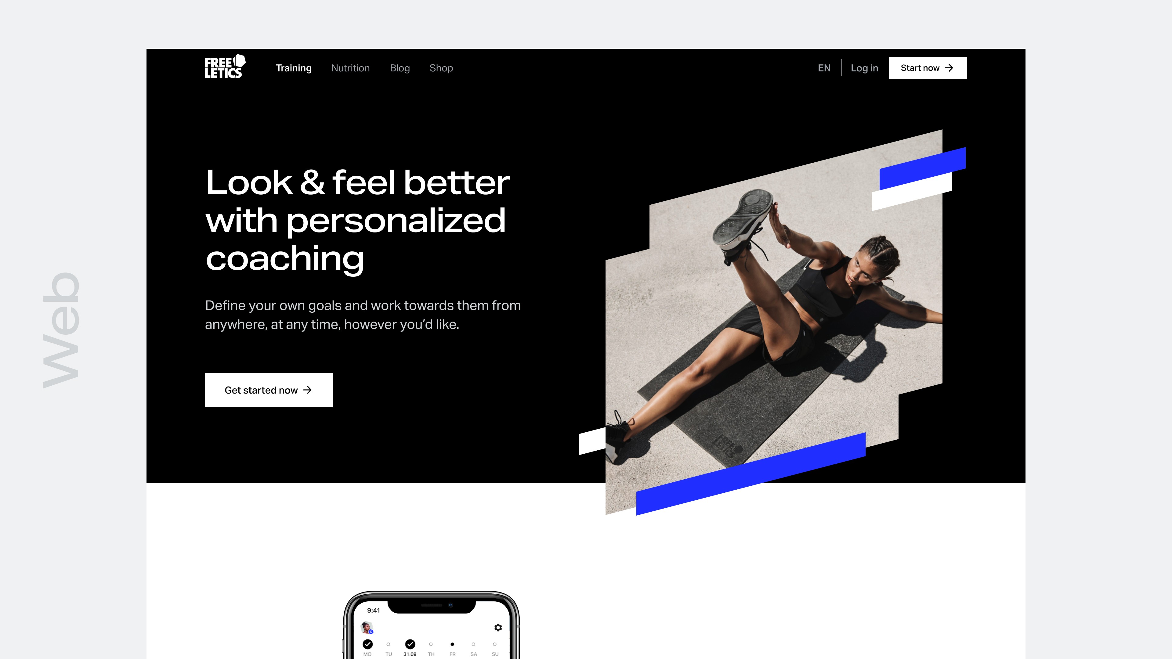
Results
Since Freeletics' inception, the overall feel of the visual language hasn't really changed. With the launch of Visual Refresh, the website, mobile app and marketing artifacts received their first solid design refresh since the company's founding. We now have a complete design system aligned between Product and Brand for the first time.
The release of Visual Refresh also corresponded with an enormous brand awareness campaign, propelling Freeletics into the future and solidifying the brand as a heavy hitter in the industry.