CABIFY
Role
Product Design & Design Ops
Tasks
Visual Design & Design System
Platforms
Mobile & Web
Year
2017
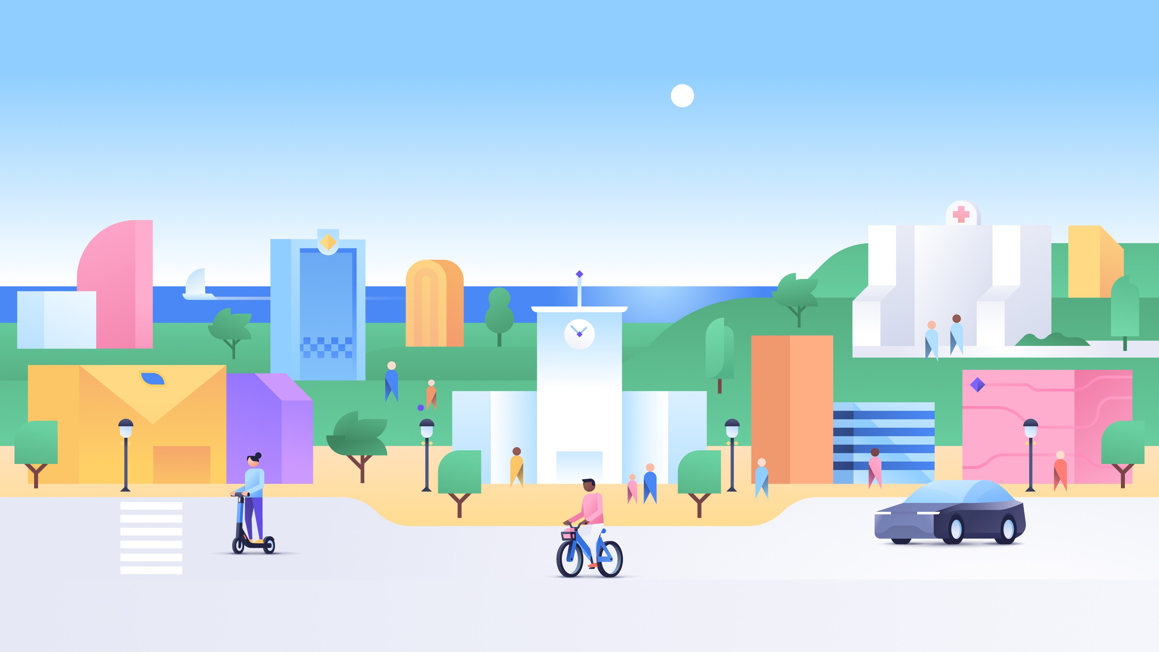
How might we redesign Cabify as a scalable product, with a more accessible design and branded design system?
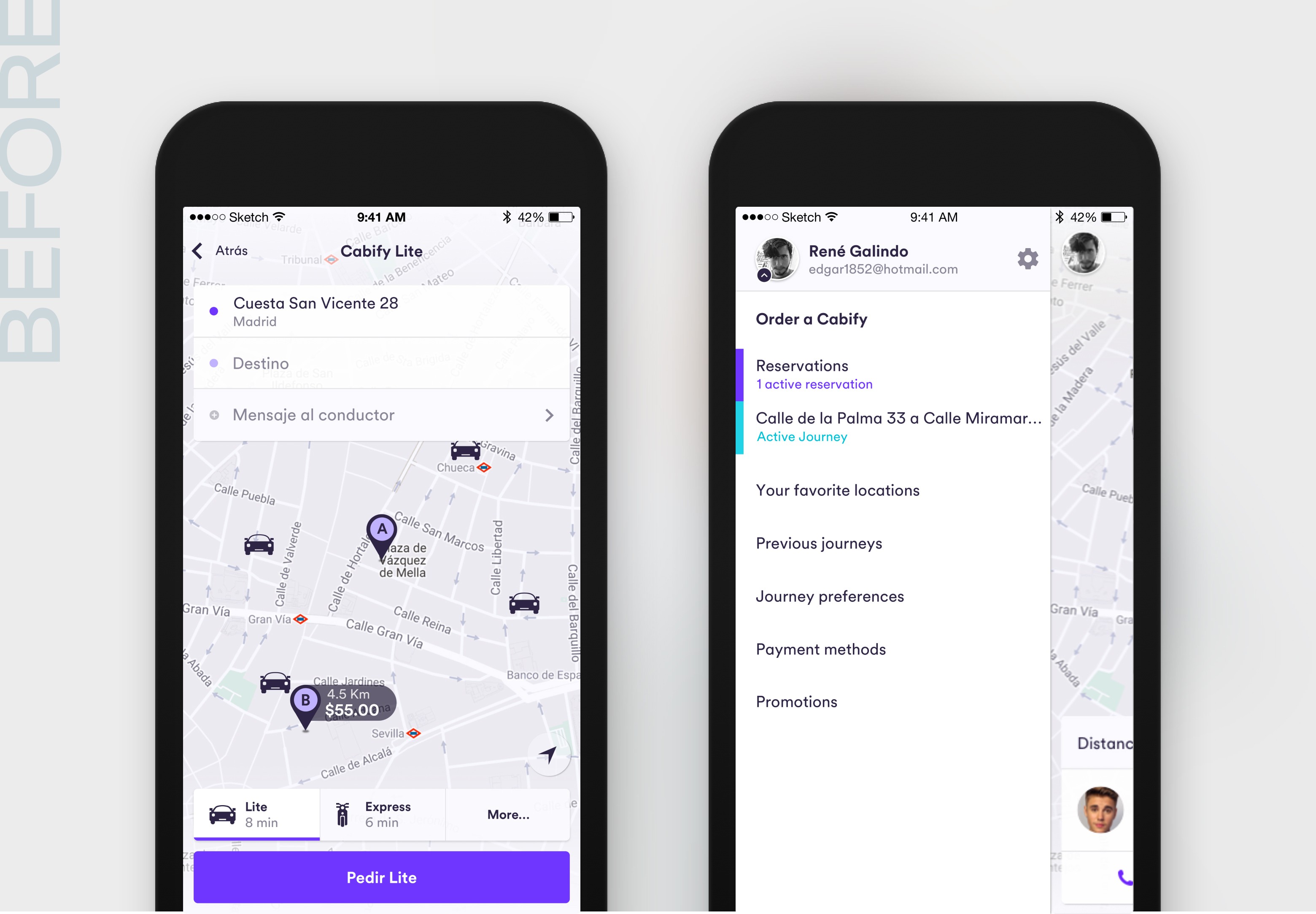
Cabify is a transportation app with over 30 million users. One of the first major projects I contributed to when I joined the design team was a redesign effort that aimed to address usability issues, cross-platform design inconsistencies and product scalability.
This project primarily included the redesign of Order a Service (the core of the product), the creation of the visual language, the cross-platform consistent design system, and the definition of the technical specifications for the implementation. As product designer, my main responsibility was focused on defining the design patterns and the visual language that was applied to the new redesign.
We had a large growth of users in our products. From a business and product standpoint, we knew that to continue to grow progressively and compete with the major players we needed to redesign the core passenger experience, offer new services and provide a common design experience. There were a handful of important issues, including:
Improving the usability of the ordering process
Unlocking product scalability and technical velocity
Consistency between brand and products
Redesign of the core experience
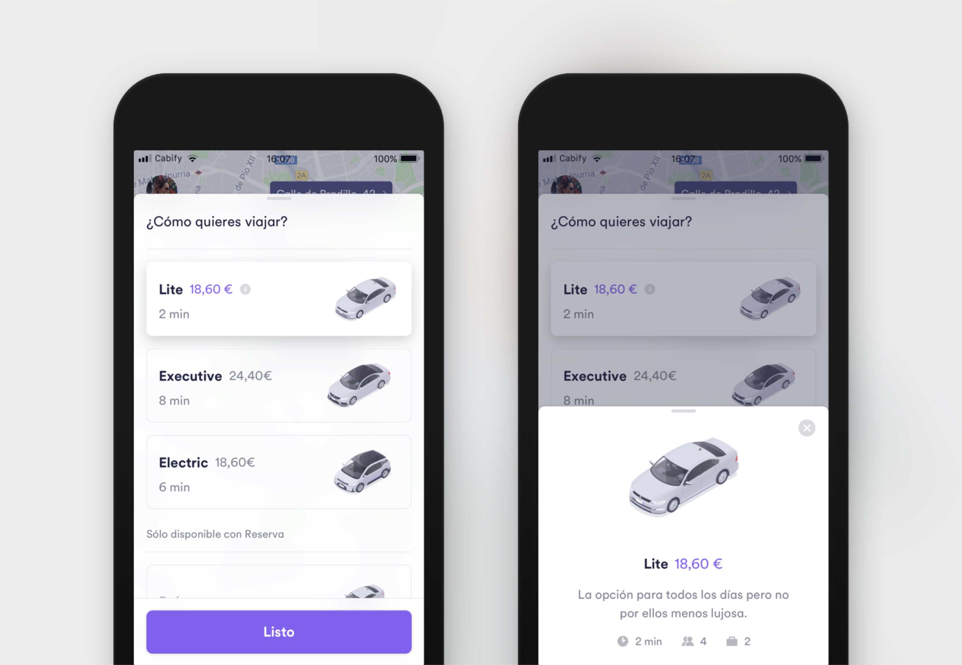
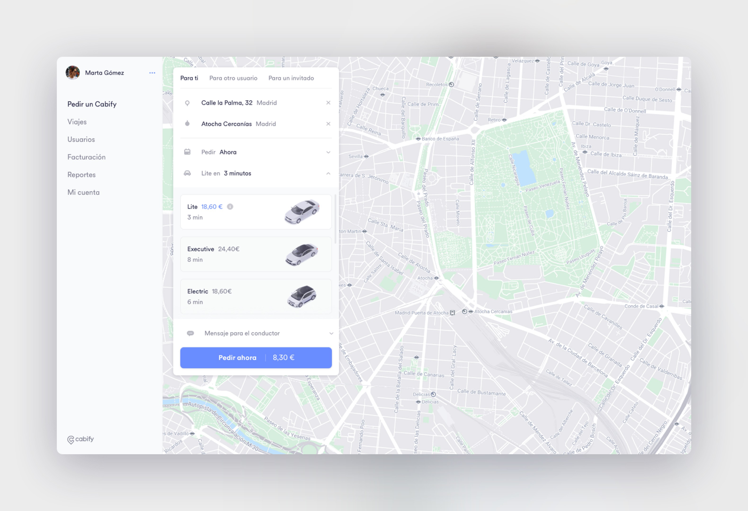
We started redesigning from the main pillar of the business: Ordering a service. We needed to improve the usability of the main navigation where users needed to understand very well from selecting the destination and choosing the most suitable service for them to picking up and dropping off the passenger. Some of the main user needs were:
Confirm that the pick-up destination is correct, due to lack of GPS accuracy
Understand the type of services and cost
Reliance on the accuracy of the estimated time

First ride-hailing app to opt for vertical navigation
One of the highlights was the step-by-step order breakdown with more transparency and more accessible navigation flow, such as a vertical panel as the main layout and more visual information, thinking about scaling future service offerings.


Consistent visual language across platforms
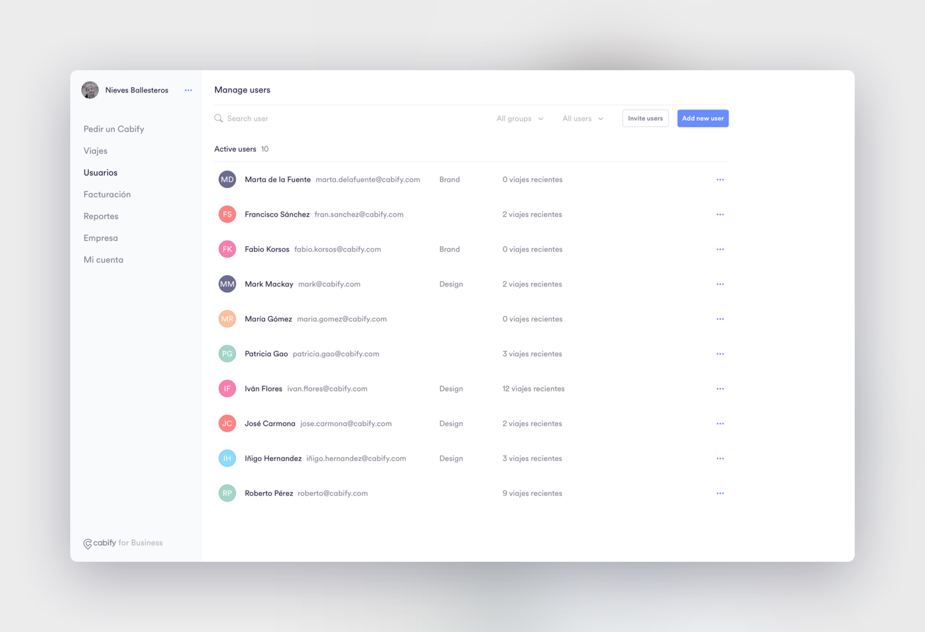
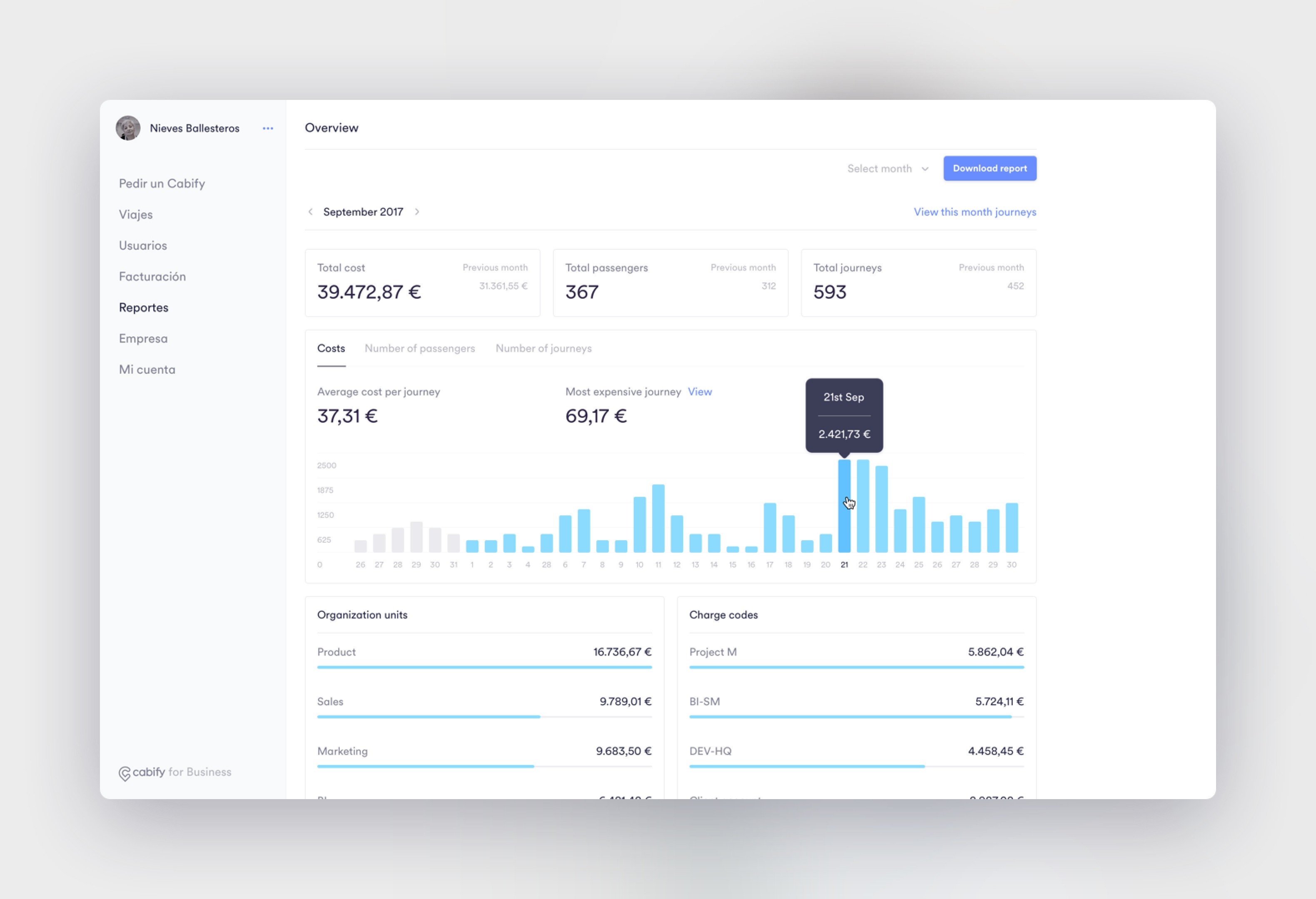
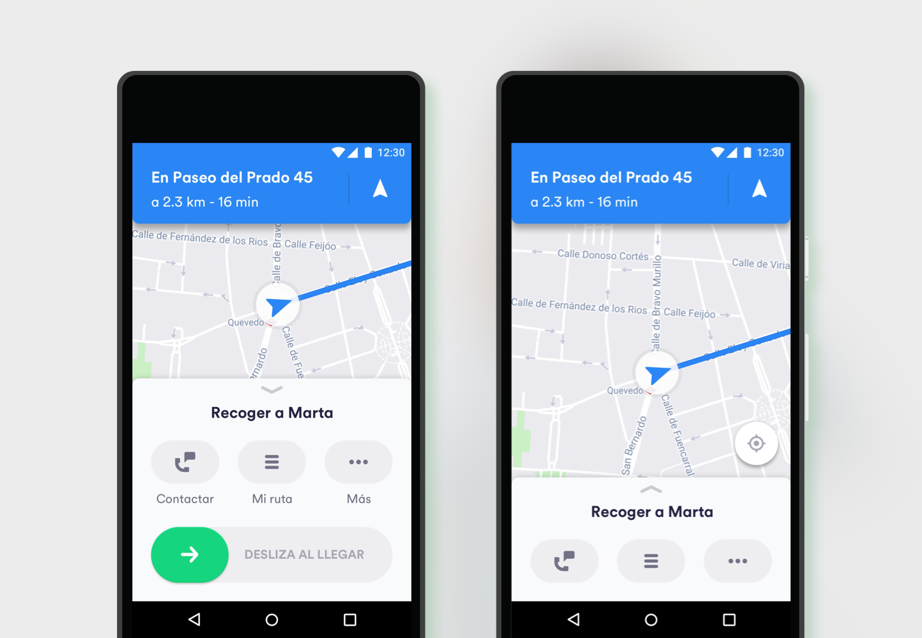
One of my biggest challenges was to adapt the consistent visual language we were defining to the web platform (B2B service) and the driver application.
The primary audience for the web platform was other companies to use as an internal tool for their employees. This meant that the information architecture and functions were much more complex. Aside from providing a solid adaptation of the ordering service design tokens to the web design, I discovered and created new features such as tracking reports and user management.
Not only passengers
In addition, the driver experience audience needed to be more like a navigation application to provide clear guidance of the service steps, navigation to the destination, and increased accessibility. Apart from the visual adaptation of the main navigation, I worked on more transparent and gamified features for drivers, such as earnings view, promotional offers and more.
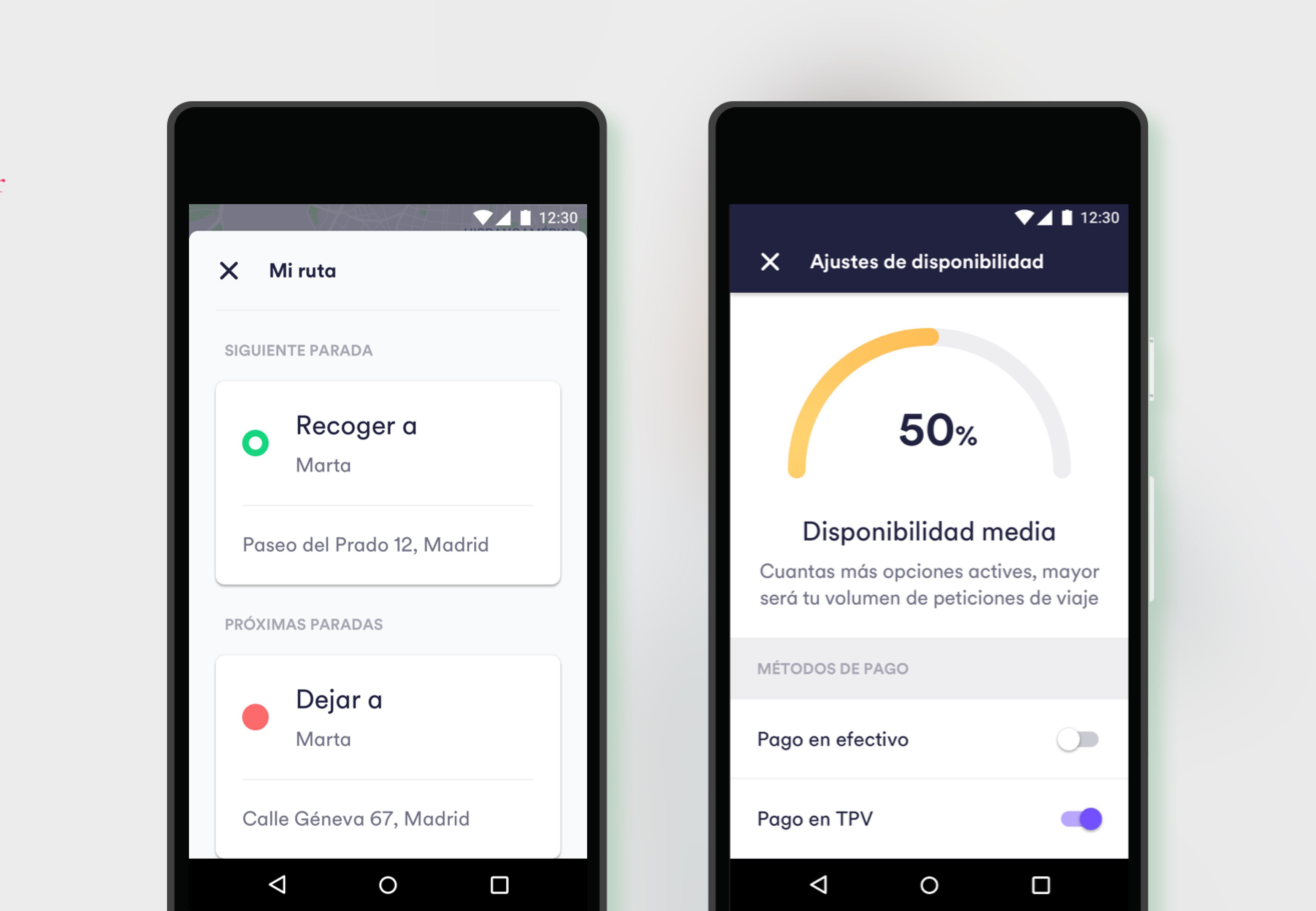
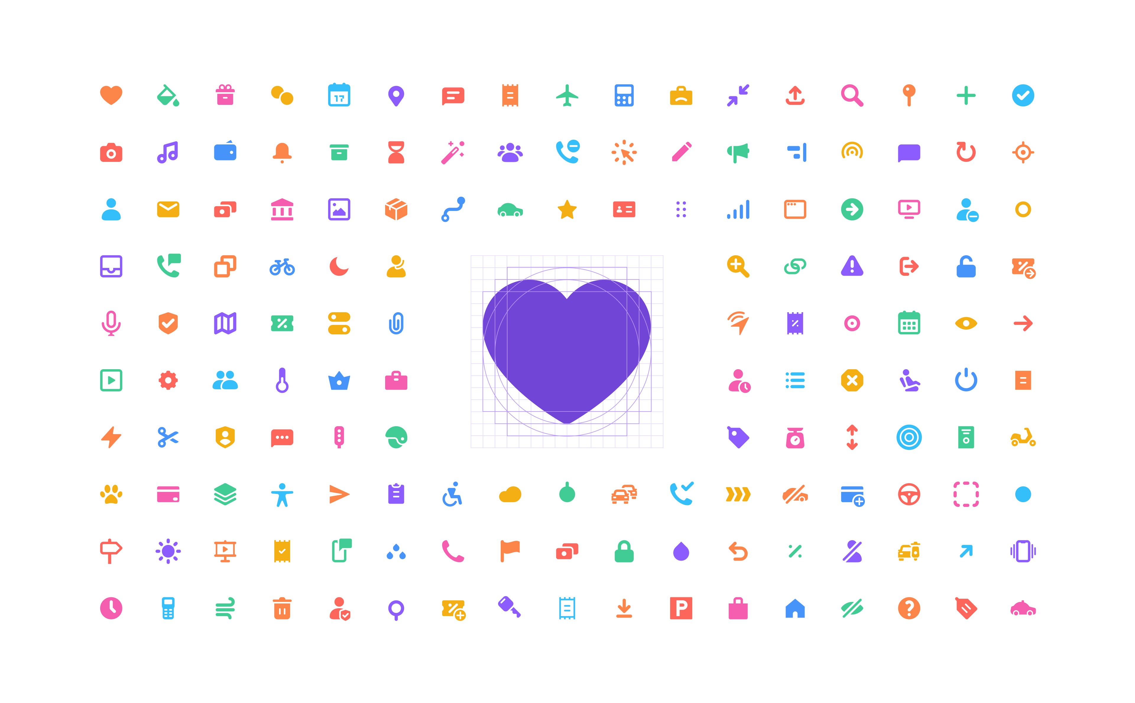
Foundation of the visual design system
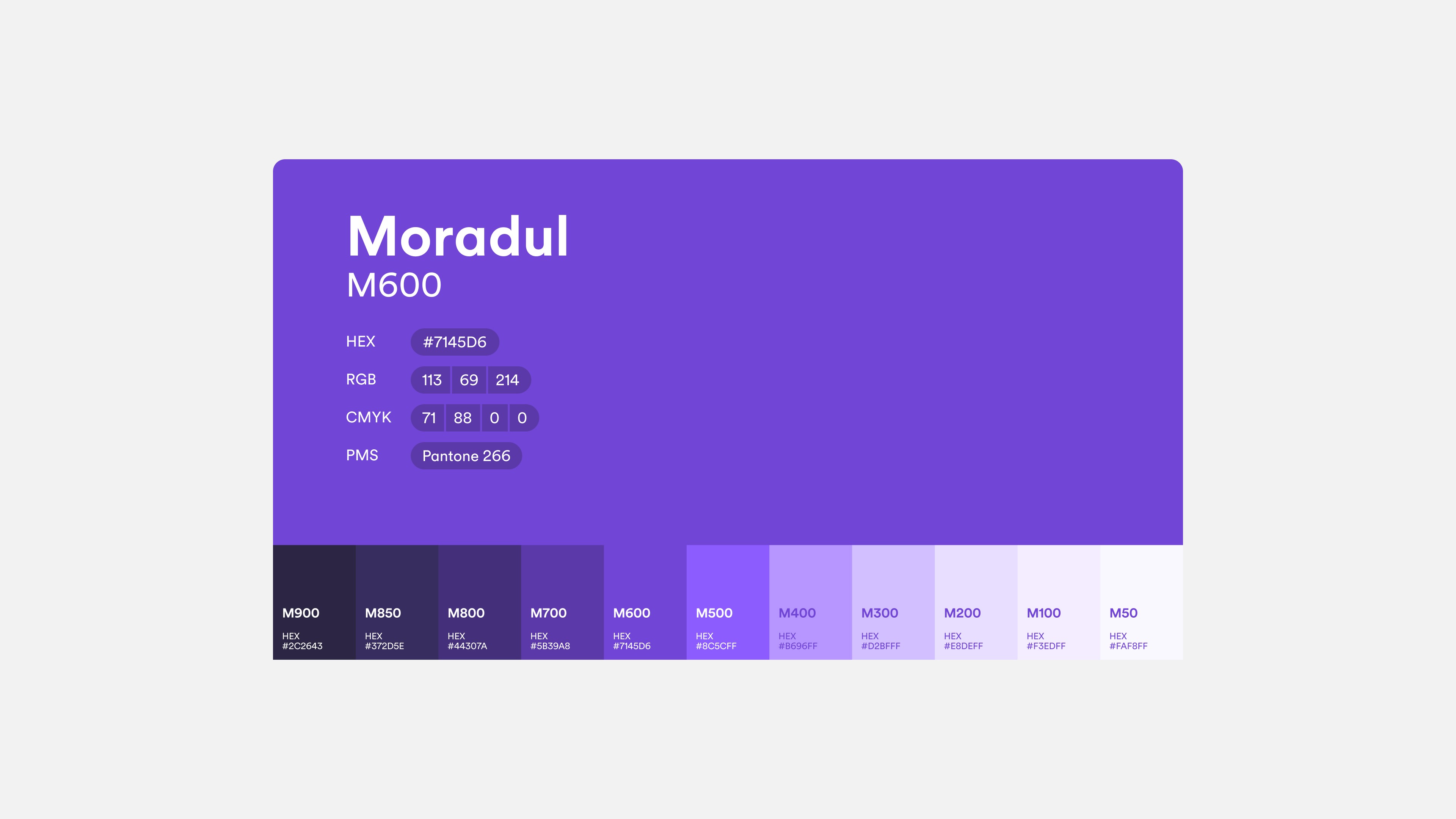
Clearly, all of this massive redesign needed to be properly documented. As a primary goal to have a consistent branded visual design components across platforms, developing for a cohesive design language between product and marketing. Creating a true single source library and style guide to help current designers and new designers or freelancers create work with confidence.


Use of the design system
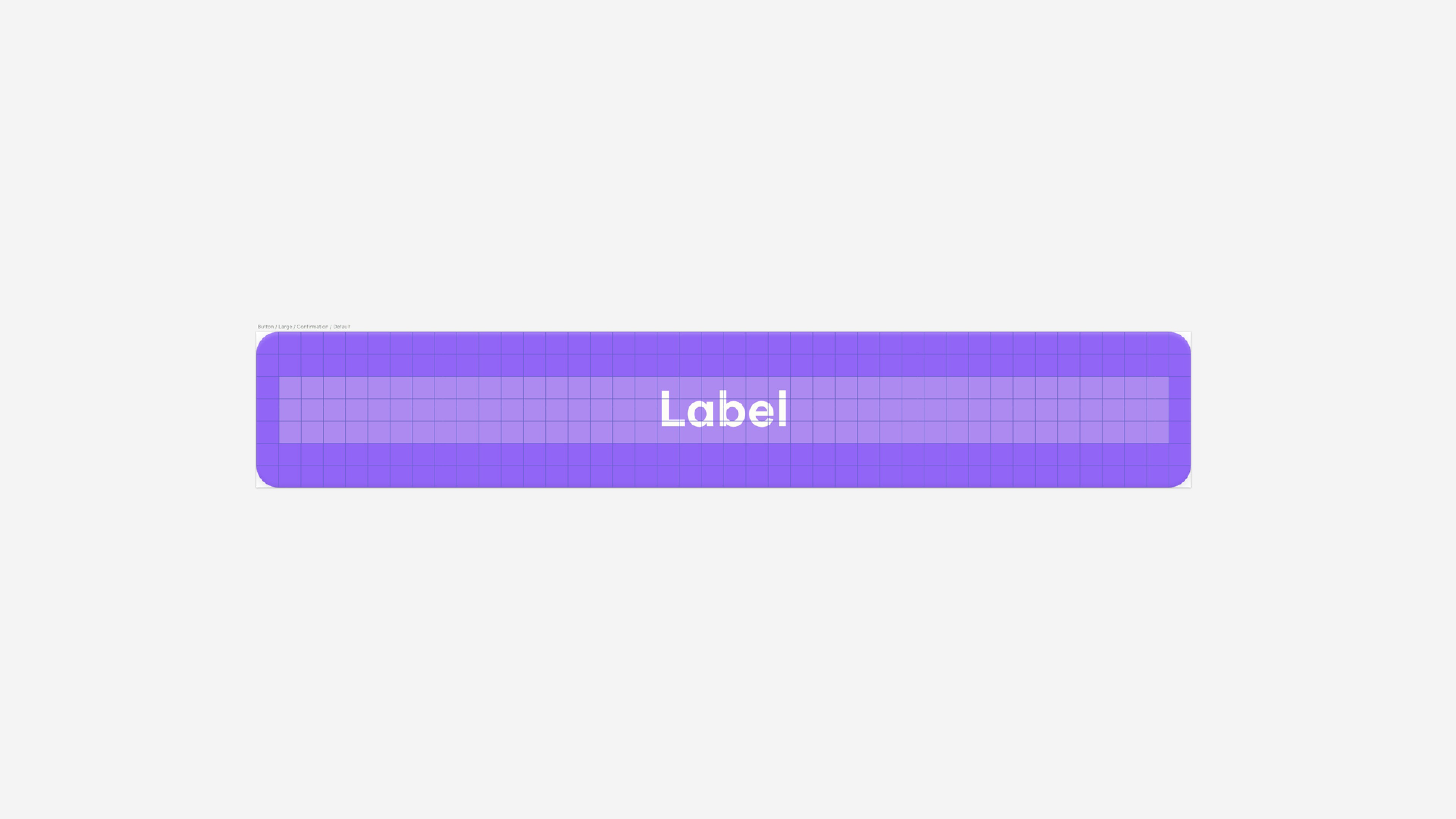
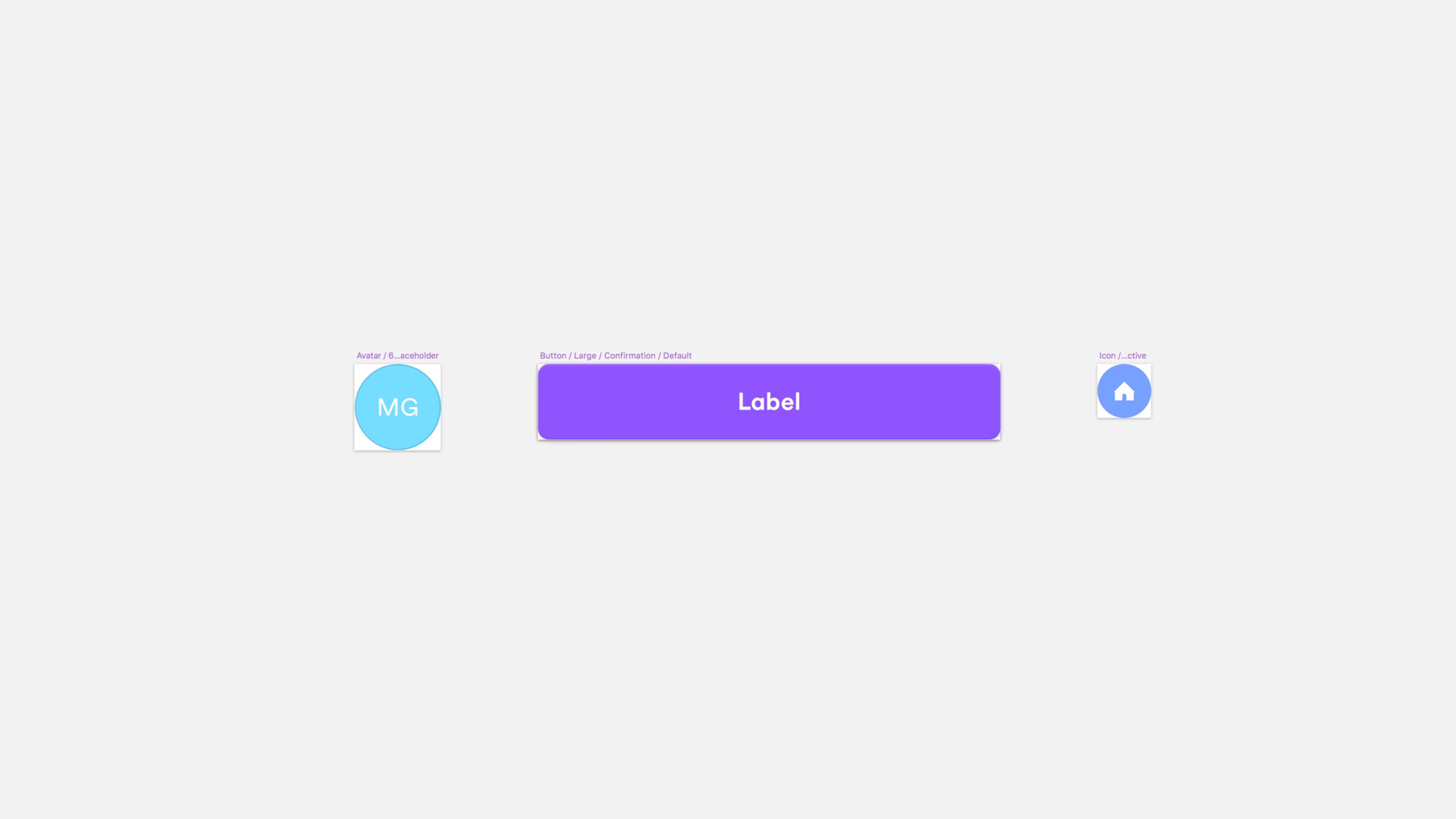
In addition, I spearheaded the creation and adoption of design components through Sketch. This work helped us quickly make updates during design changes, eliminated a significant amount of design debt, and now allows teams to build designs even faster.


Technical specifications and handoff
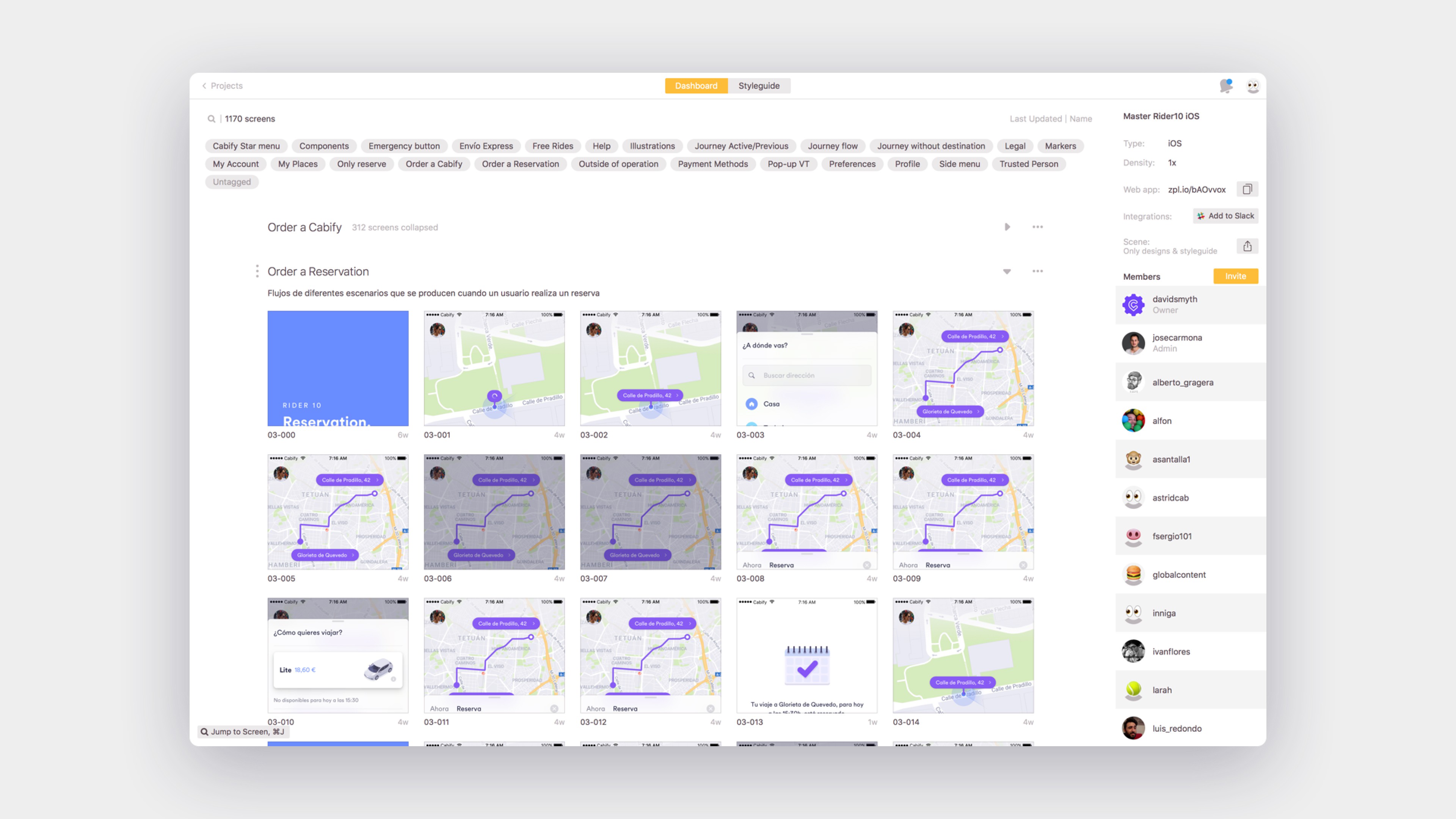
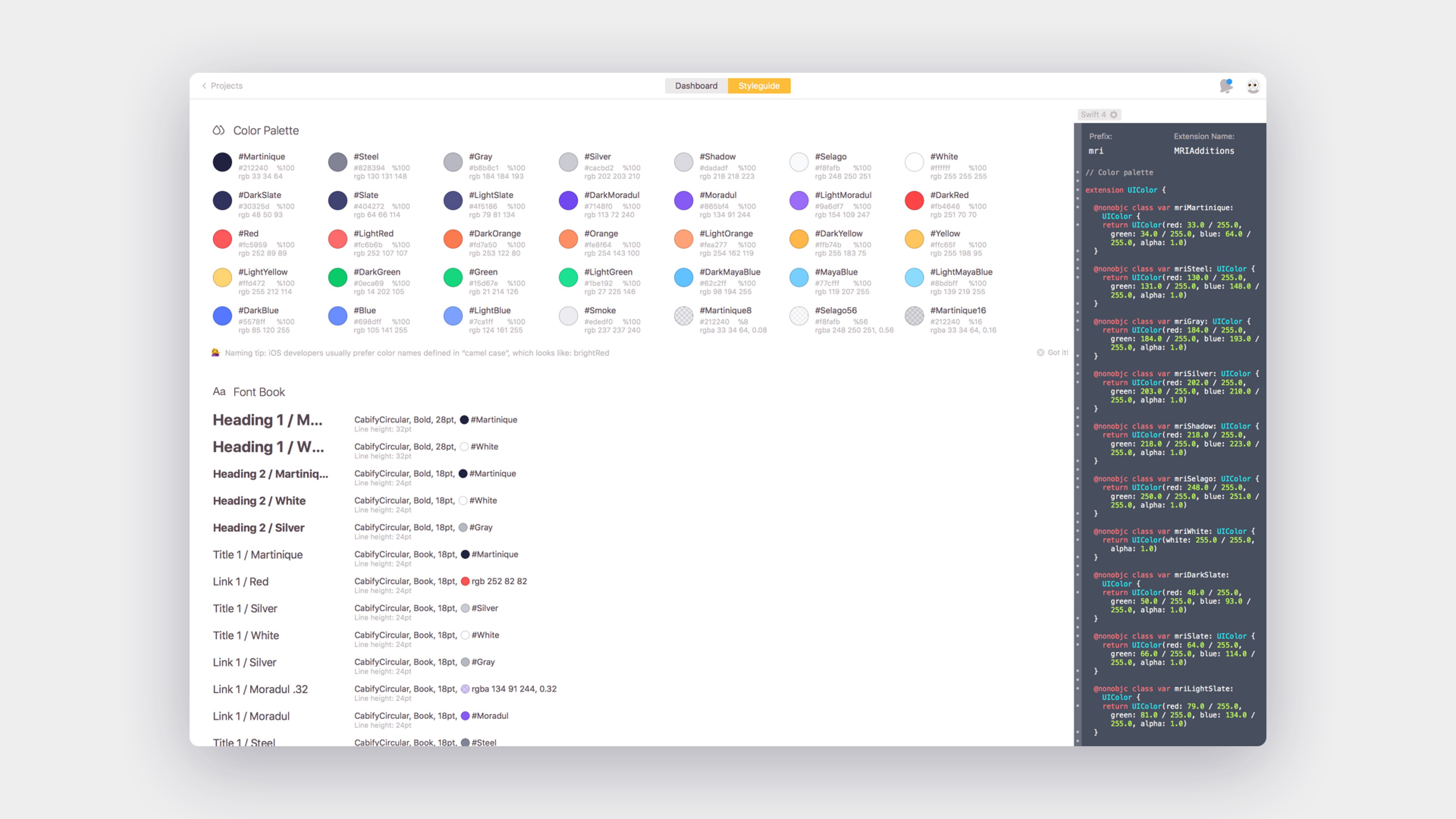
All of this wasn't going to be real without strong alignment with engineering. To that end, I worked to share all the design component specs with Zeplin, where developers could copy all the design specs and font and color styles successfully, having a continuous feedback loop with them to improve the implementation.
Approaching the code
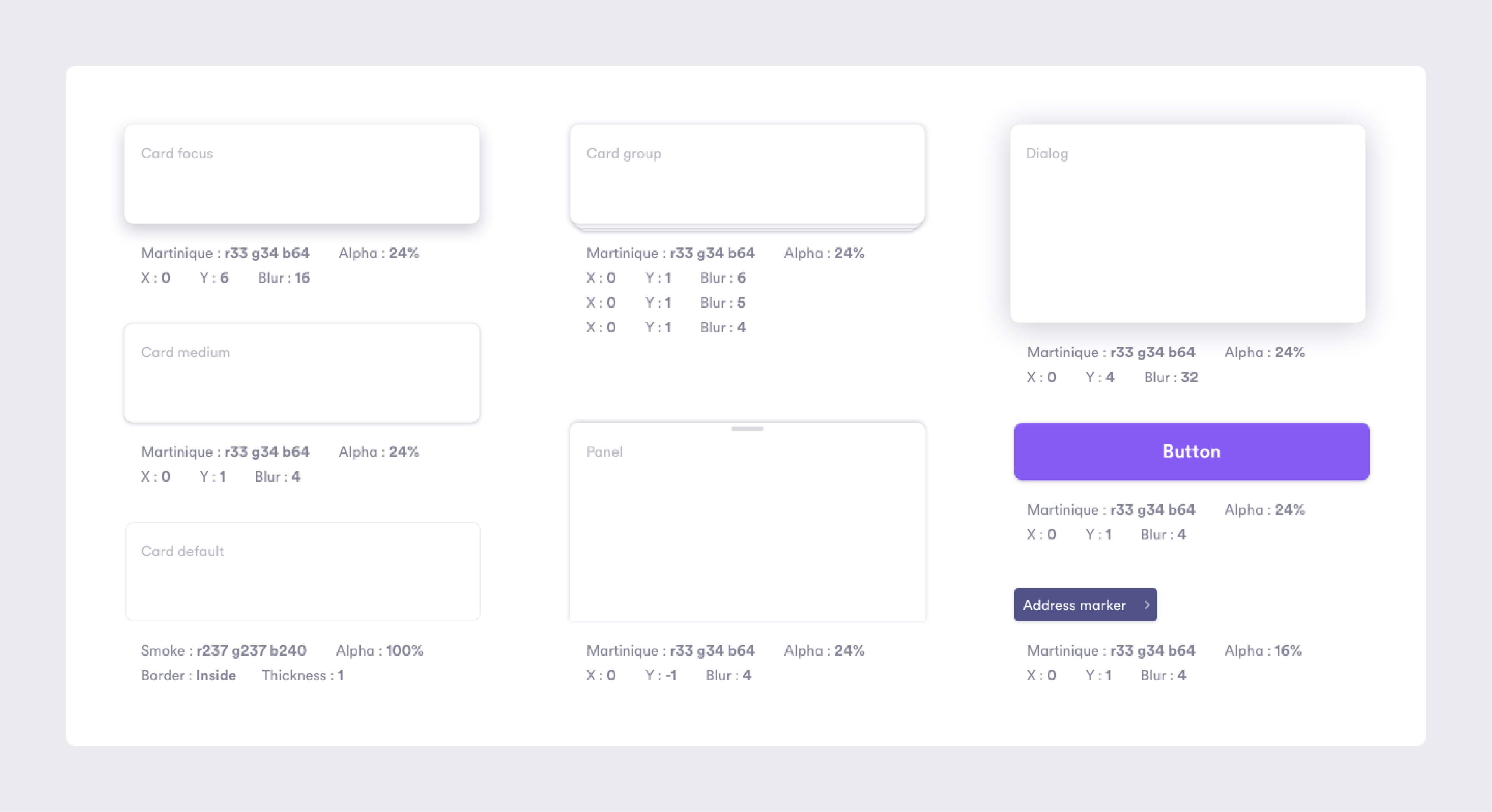
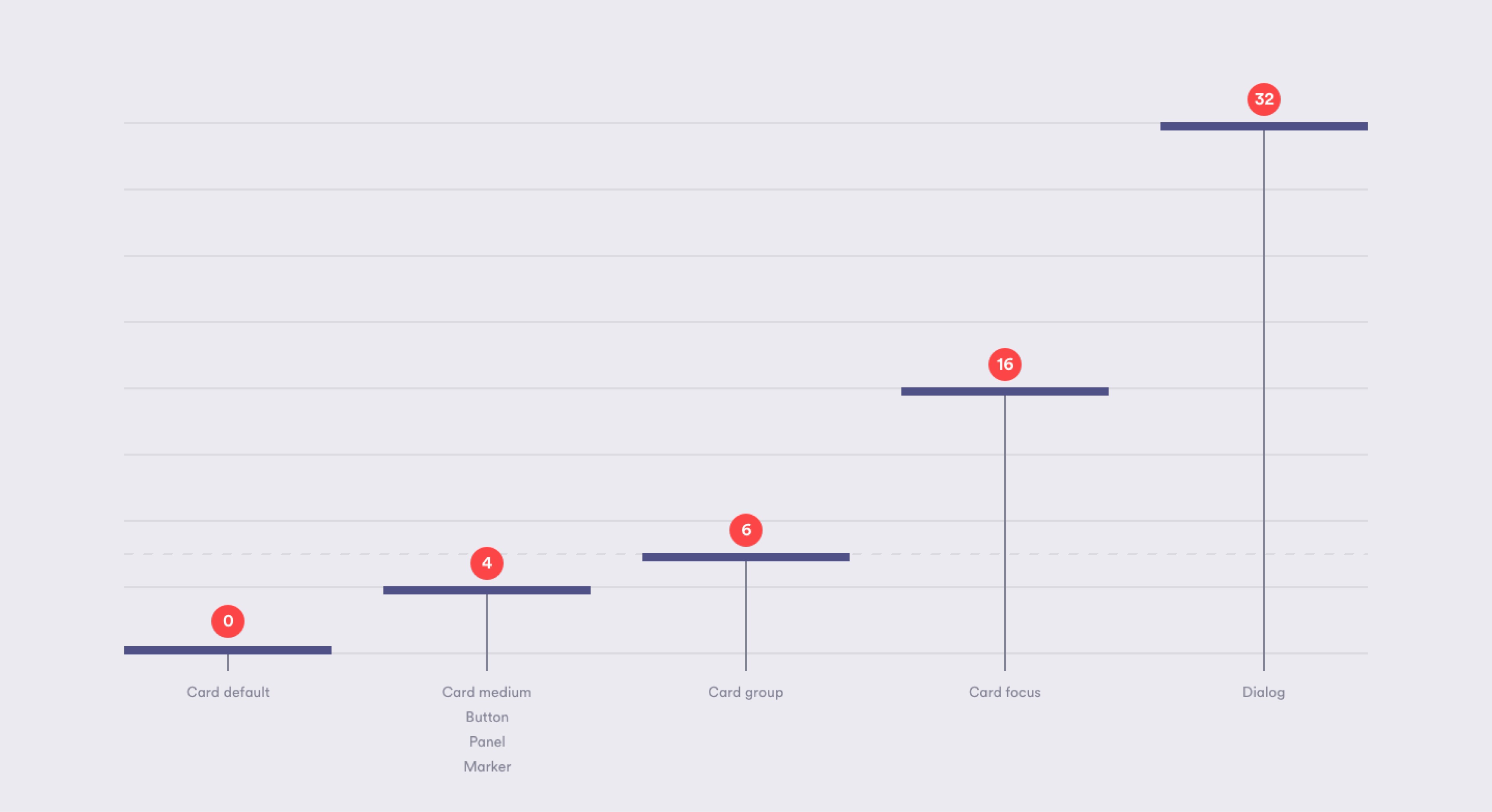
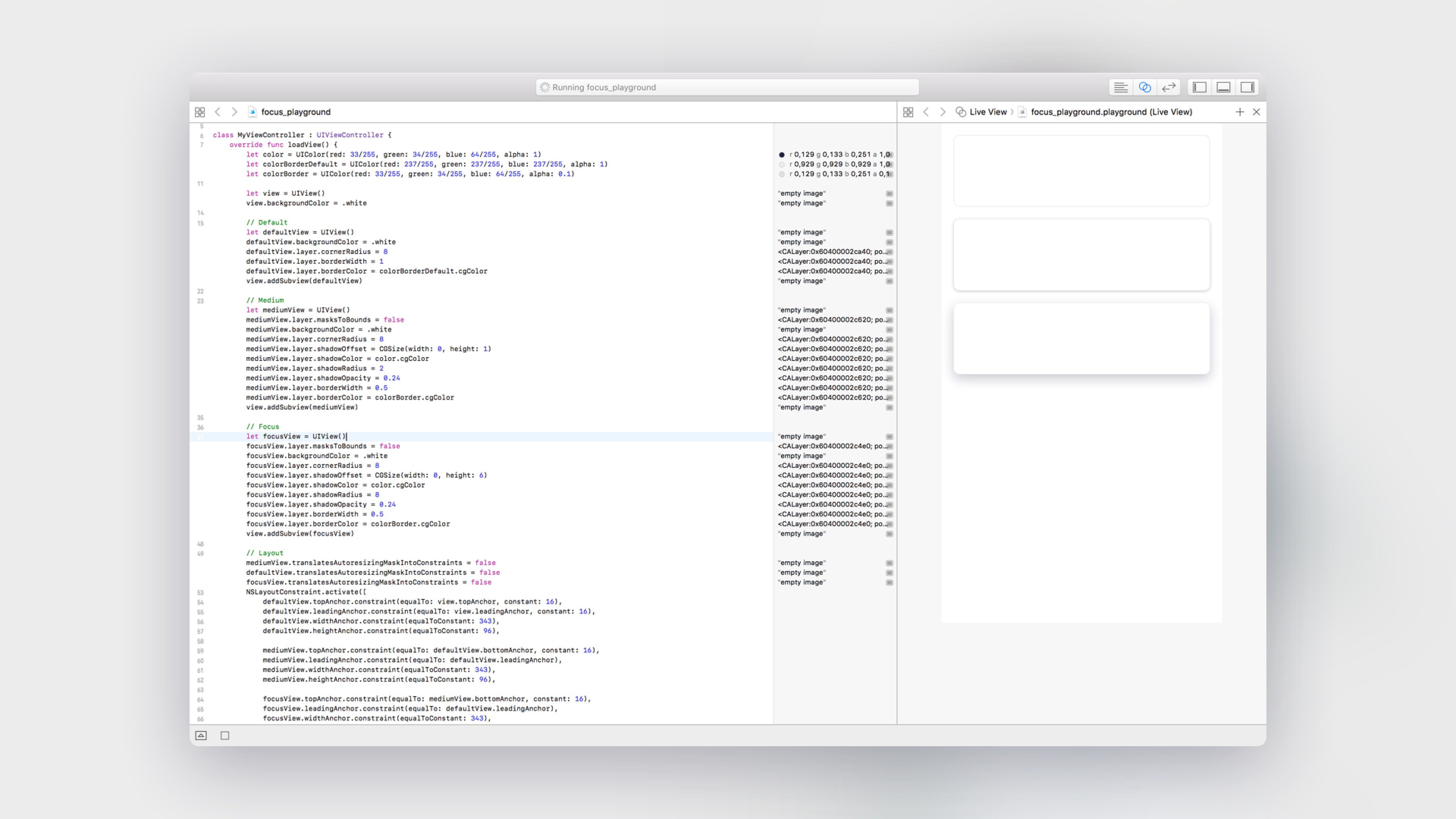
One of my biggest learnings was to create a playground in Xcode with the main components we used in the apps, the UI of the panels and cards. I defined by code (Swift) the exact proportions and elevations of each component. These elements were critical in the visual design language to have a successful user experience.
The biggest success after the redesign
Cabify's already high Passengers App Store ratings increased after the redesign. Our product averaged 4.8 stars on Android and iOS within weeks of launch. Considering that many apps lose ratings after a redesign, this is a considerable achievement.
More importantly for the company, Cabify's user retention rates and user growth experienced statistically significant increases in the months following the redesign launch.
